CREATIVE BRIEF
Because WB100, the celebration of 100 years of Warner Bros., is a company wide initiative, a thorough and thoughtful style guide is required to ensure the campaign has a cohesive branded look.
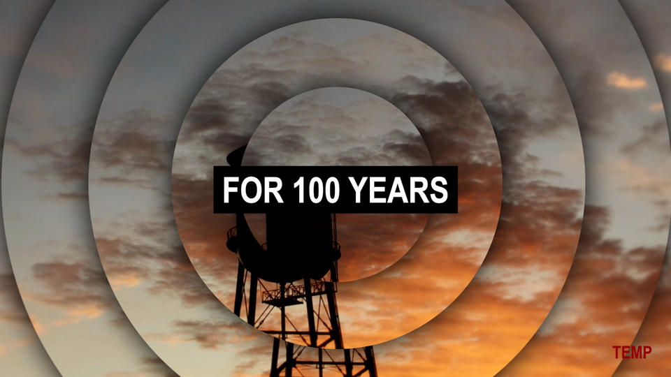
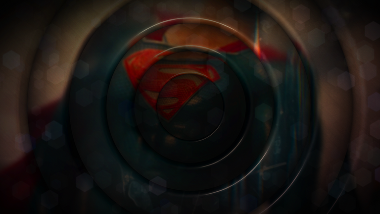
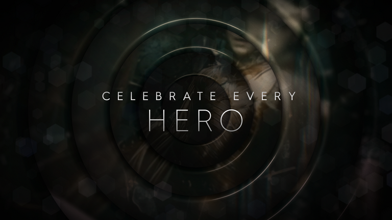
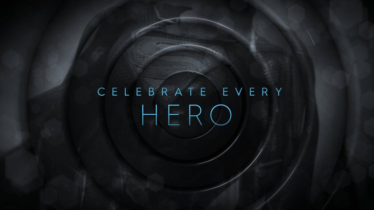
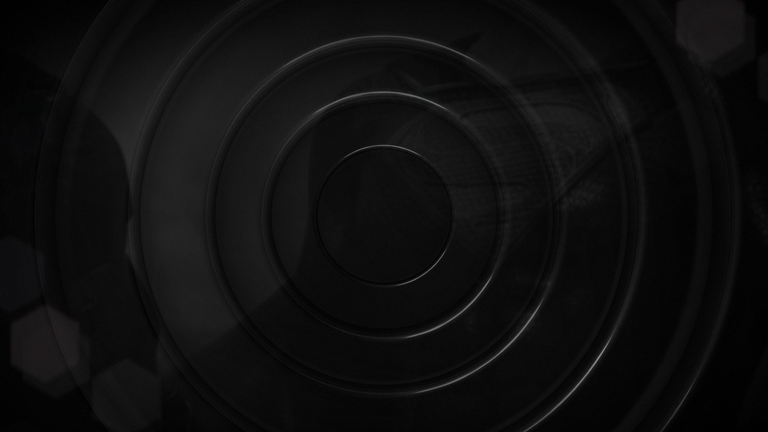
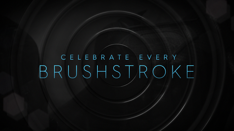
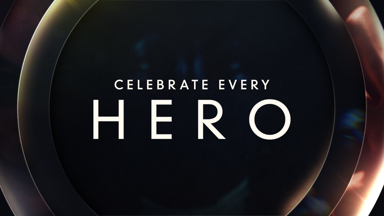
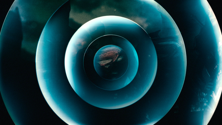
We’ve been provided with two edits that have distinct directions: Fan Forward (fig. 1), which focuses on WB’s storytelling legacy and Future Innovations (fig. 2), which focuses on tomorrow’s greatness. These edits will provide our conceptual foundation and visual jumping off point. We will combine Fan Forward’s elegant typography over superhero visuals (fig. 3) with Future Innovations’ reimagined “That’s All Folks” concentric circles (fig. 4) to create the perfect centennial celebration.
fig. 1
fig. 2
DESIGN NOTES
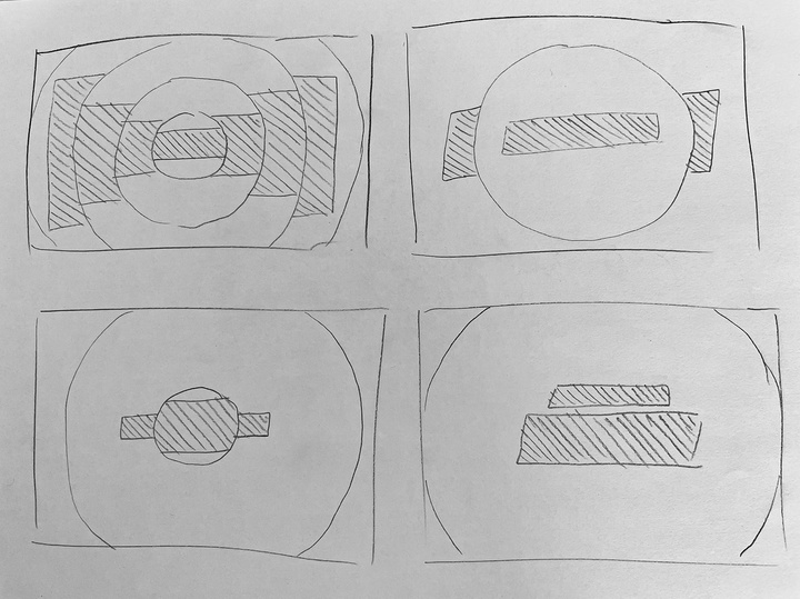
Concentric circles will be modern, remain center aligned, and vary in size, quantity and depth. Additionally, they will have the ability to magnify and break apart images and typography behind them.
Background imagery of dimensional elements and textures inspired by iconic superheroes (metals, rocks, glowing elements, lightning, etc.) will be obscured by tight, asymmetrical cropping to create compositions with an allusive aesthetic.
Typography will be dynamic using the typeface currently used in ‘Fan Forward’ as well as exploring other options.
Light leaks or flares will be rich in depth rather than top layer footage overlays.
fig. 3
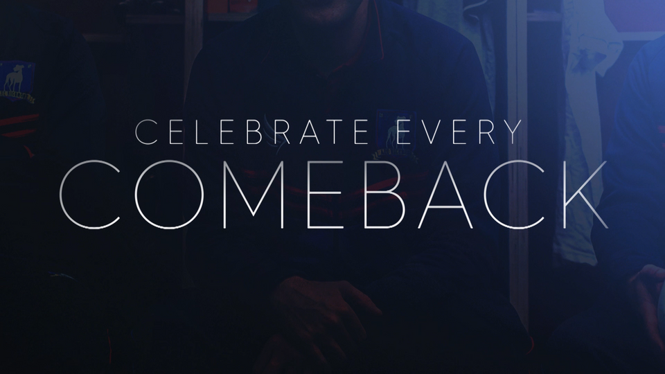
fig. 4
CLIENT ANIMATION AND DESIGN IDEATIONS

Style Frames & Animation Direction
We created Classic Rings by relying heavily on the original Warner Bros. concentric circles in ring size, bevel, and depth.
CLASSIC RINGS
Classic Rings | Footage: Extreme Color Treatment
Hurme Geometric Sans 3 | Regular & Thin
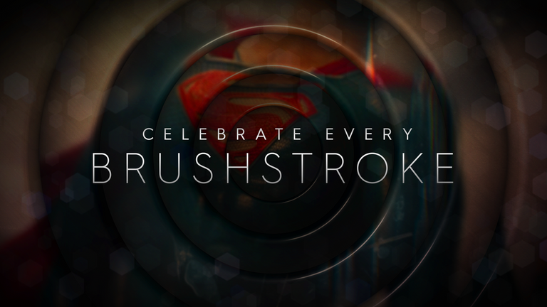
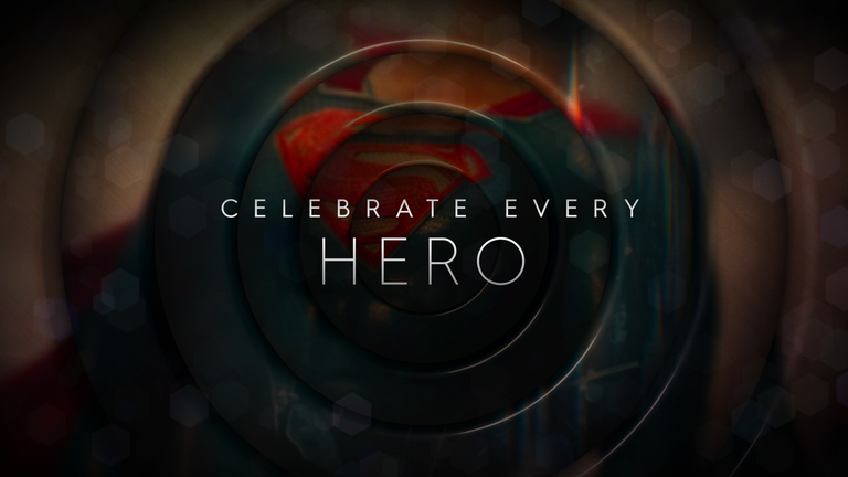
Hurme Geometric Sans 3 | Regular & Thin
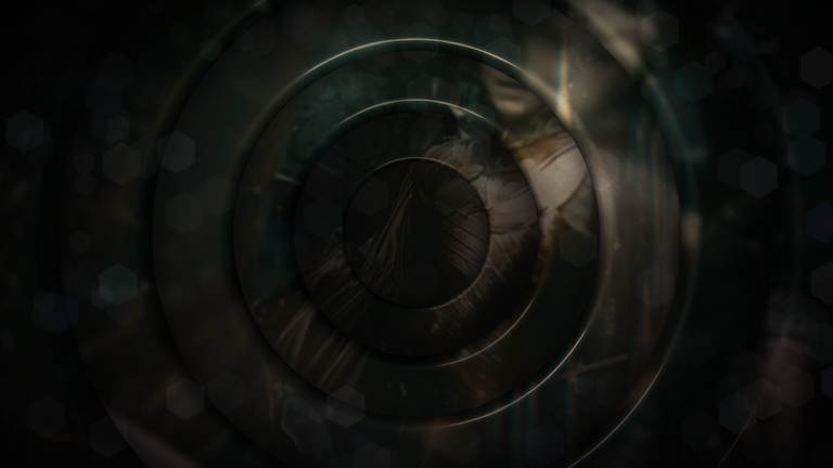
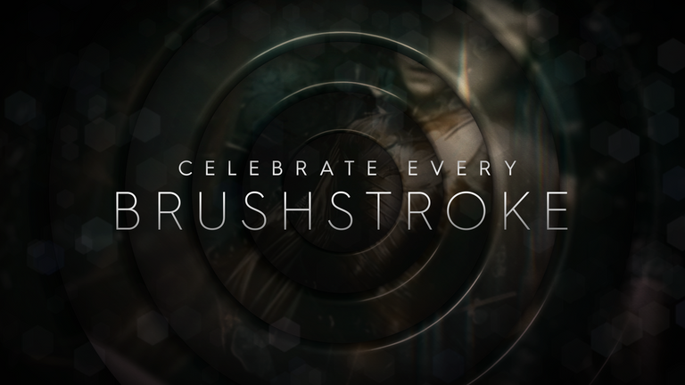
Classic Rings | Footage: Black & White with Slight Tint
Hurme Geometric Sans 3 | Regular & Thin


Classic Rings | Footage: Tightly Cropped Dark Tint
Hurme Geometric Sans 3 | Regular & Thin
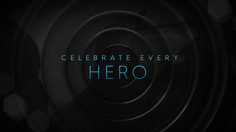
Classic Rings | Texture: Milky Way
Hurme Geometric Sans 3 | Thin & Light

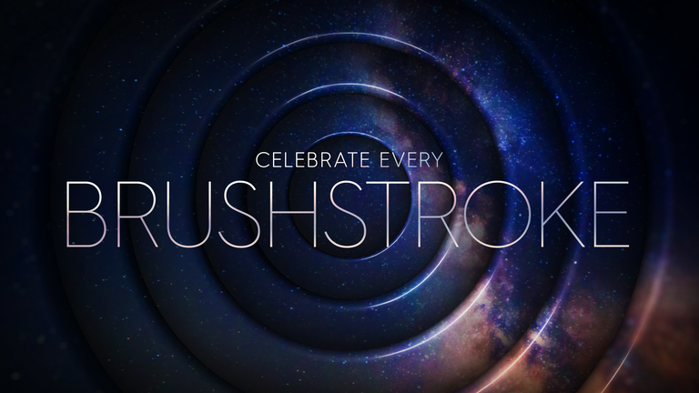
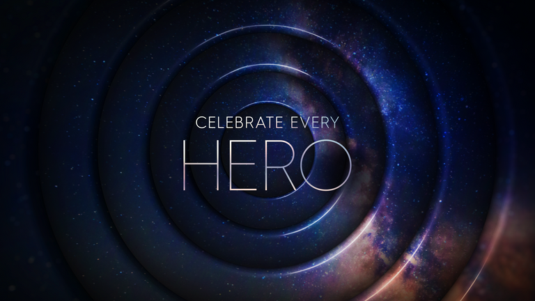
Classic Rings | Texture: Metal
Hurme Geometric Sans 3 | Thin & Light
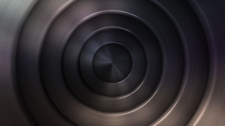
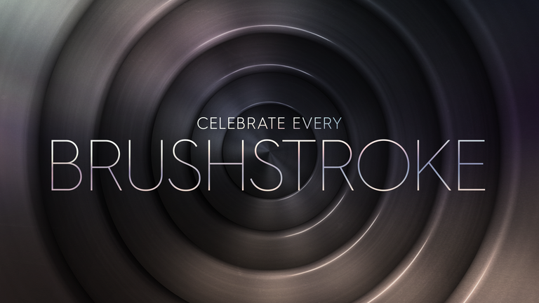
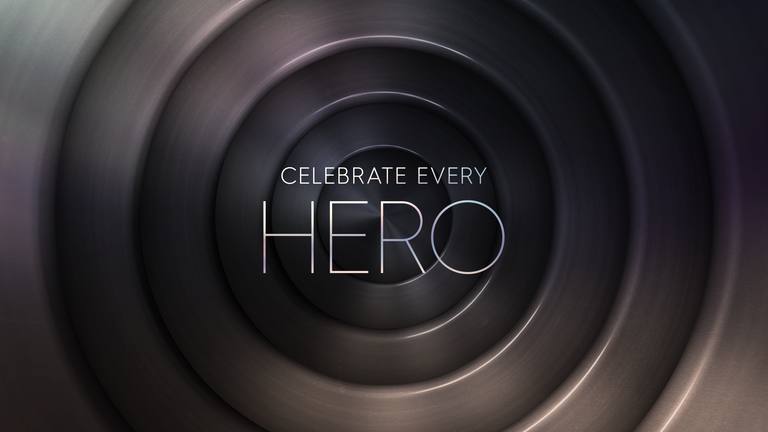
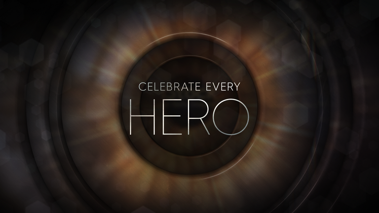
Classic Rings | Texture: Macro Eye
Hurme Geometric Sans 3 | Thin & Light
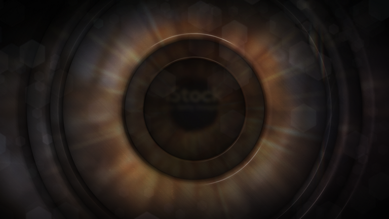
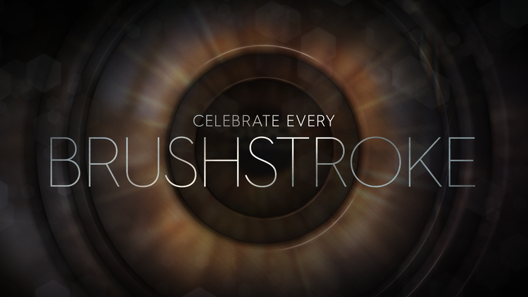
Classic Rings | Texture: Lens
Hurme Geometric Sans 3 | Thin & Light
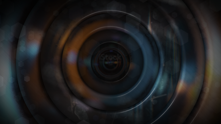
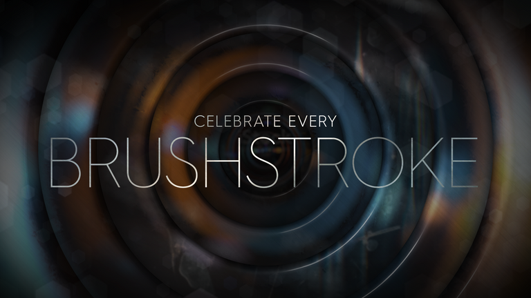
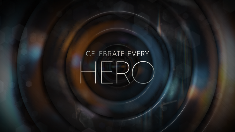
Classic Rings | Animation Direction
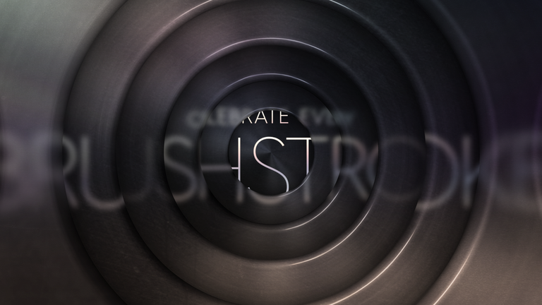
1. The text is seen distorted and blurred through several layers of rings as if seen through glass.
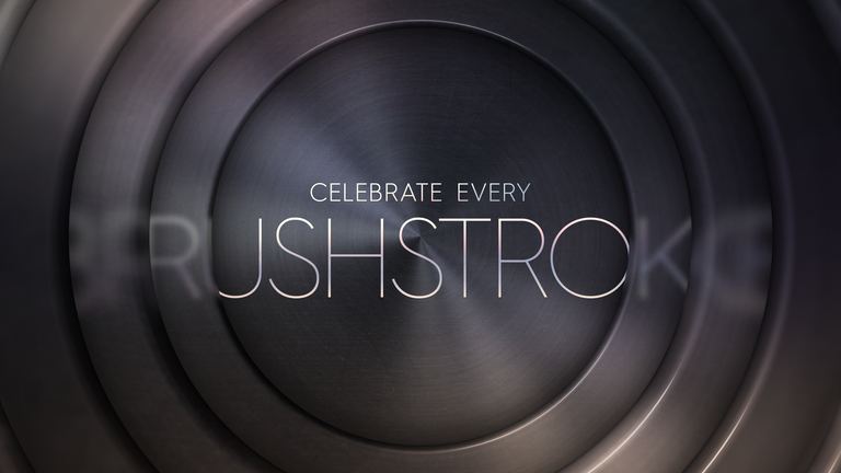
2. As the final ring animates out from the center it shows the full undistorted title.
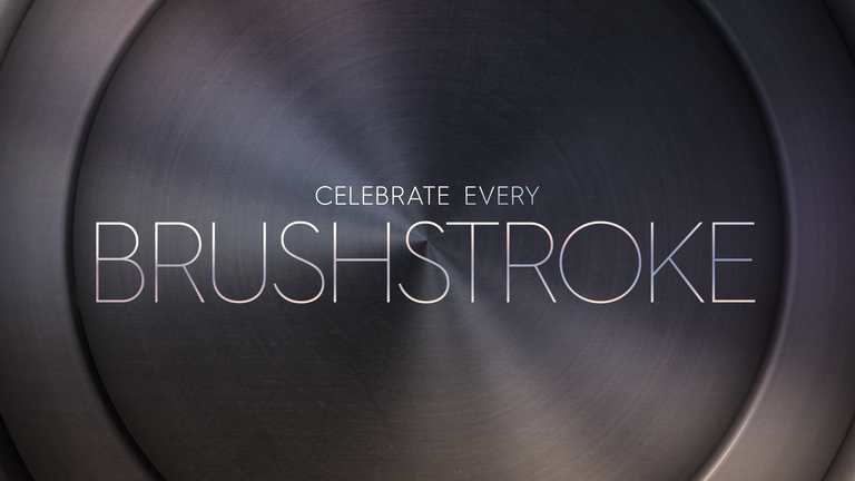
3. The speed of the final ring slows to a stop framing the text.

1. The text is seen distorted and blurred through several layers of rings as if seen through glass.
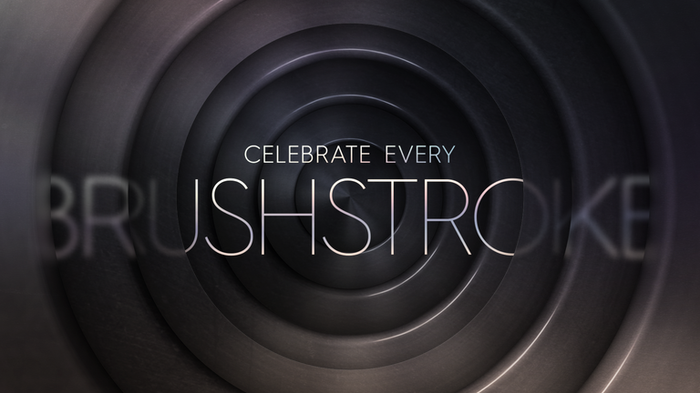
2. As the final ring animates out from the center it shows the full undistorted title. Behind the title a new set of rings animates from the center replacing the first set.
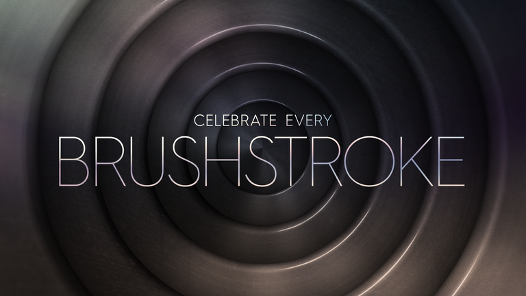
3. The speed of the rings slows down to a subtle expanding movement creating a look similar to the classic concentric circles of WB cartoons.
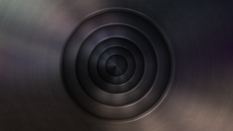
1. A series of concentric circles animates out from the center.
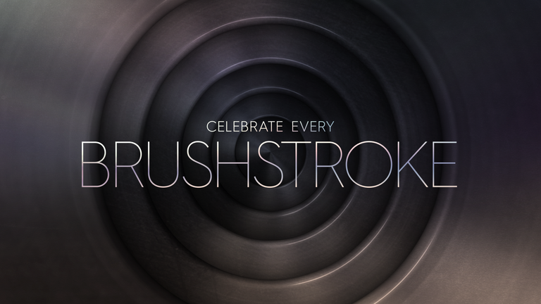
2. As the rings expand text quickly appears in the center with a shimmer also growing in scale similar to the circles.
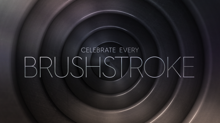
3. The speed of the rings slows down to a subtle expanding movement creating a look similar to the classic concentric circles of WB cartoons.
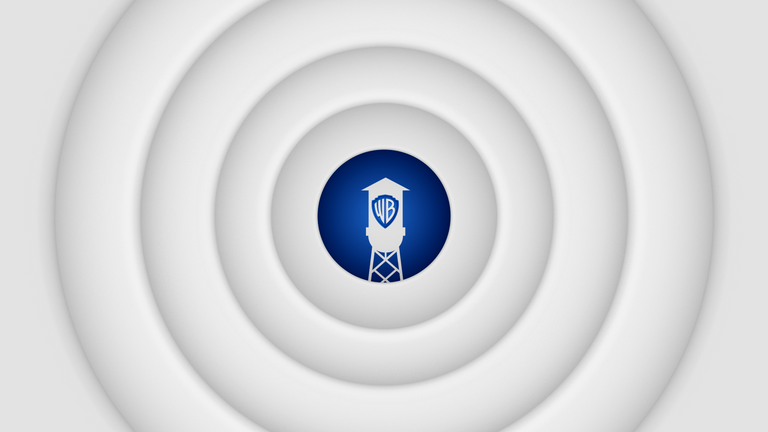
1. Rings animate out from the center of the screen.
On the last ring layer the Iconic WB tower sits in the very center.
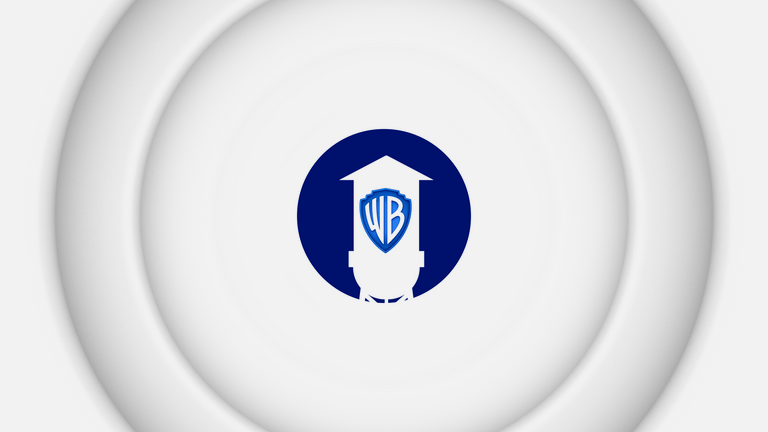
2. The circle framing the tower stops animating as the rest of the rings complete their animation clearing screen.

3. As the last of the rings clears screen the 0 shifts to the left motivating the rest of "100" to slide into place next to it. Then the tagline animates in beneath, completing the WB 100 years logo.
Style Frames & Animation Direction
We explored a modernized take on the Classic Rings through the use of varied sizes, depth, and light sources.
MODERN RINGS
Modern Rings | Footage: Distorted
DIN 30640 Pro | Neuzeit Grotesk
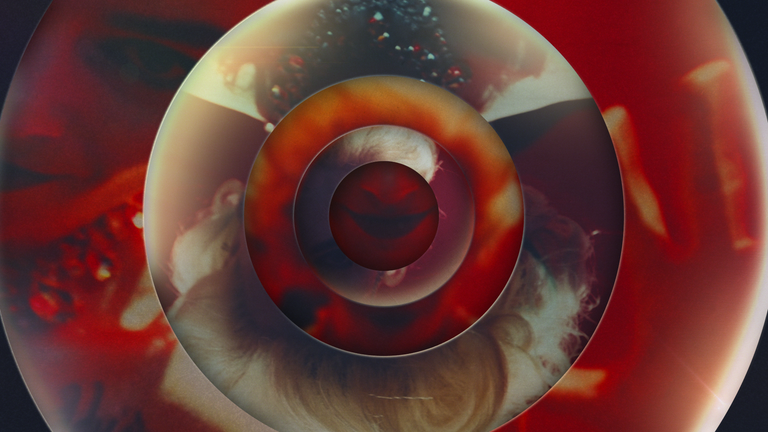
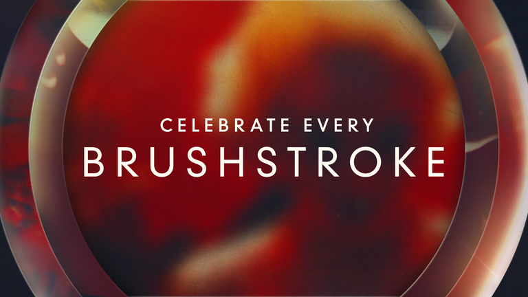
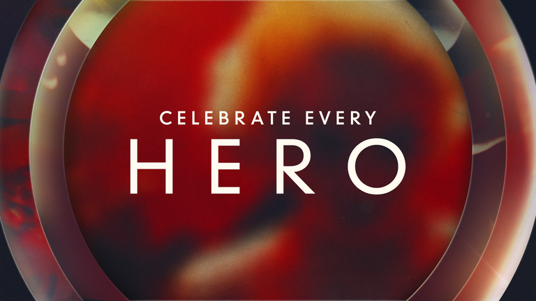
Modern Rings | Footage: Collage
DIN 30640 Pro | Neuzeit Grotesk
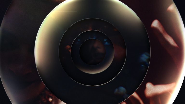
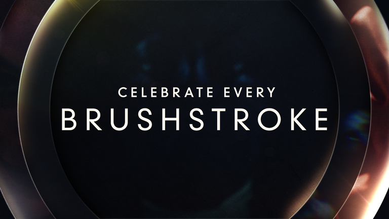
Modern Rings | Footage: Night
DIN 30640 Pro | Neuzeit Grotesk
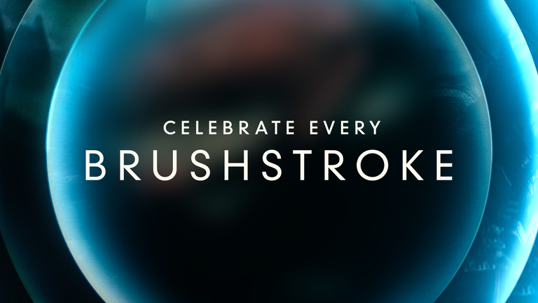
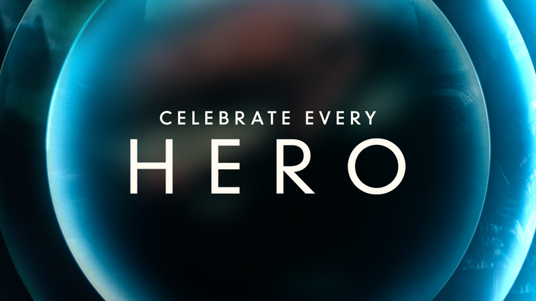
Modern Rings | Footage: Dawn
DIN 30640 Pro | Neuzeit Grotesk
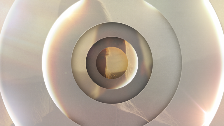

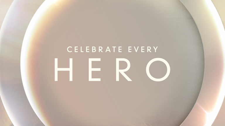
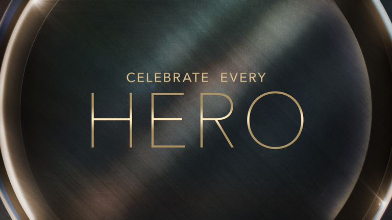
Modern Rings | Texture: Metal
Avenir Next | Ultra Light & Medium
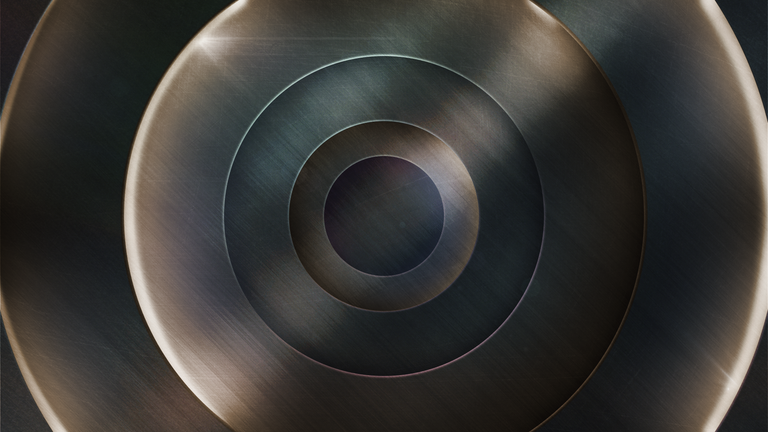
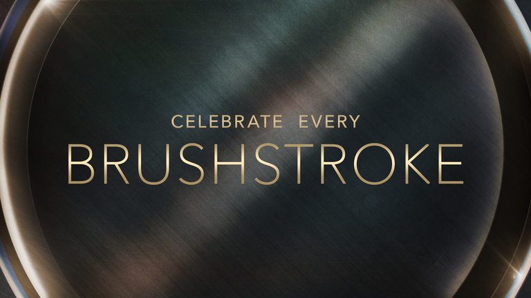
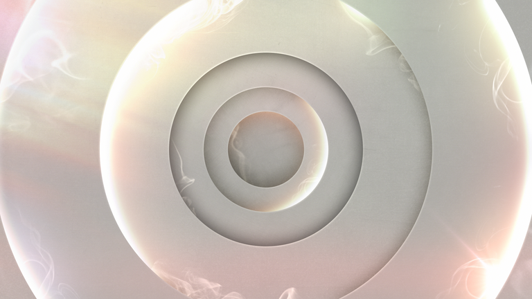
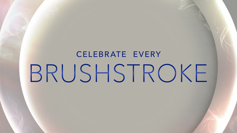
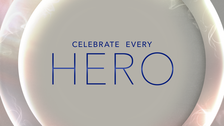
Modern Rings | Texture: Bright Smoke
Avenir Next | Ultra Light & Medium
Modern Rings | Texture: Lightning
Avenir Next | Ultra Light & Medium
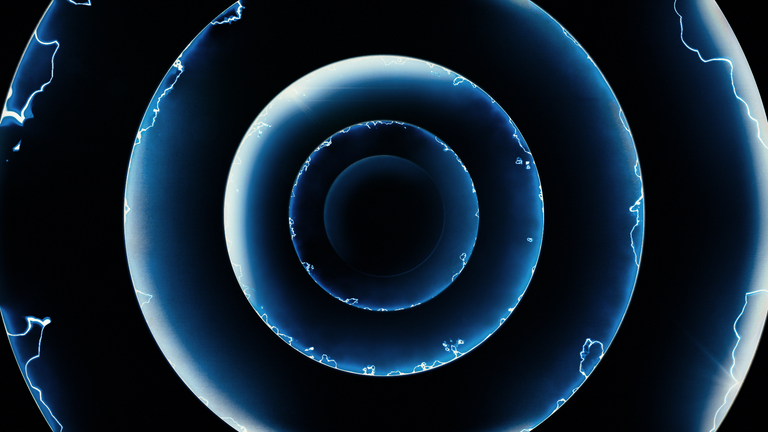
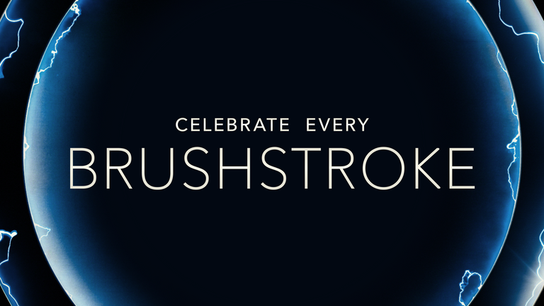
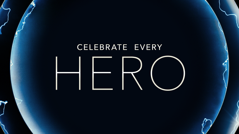
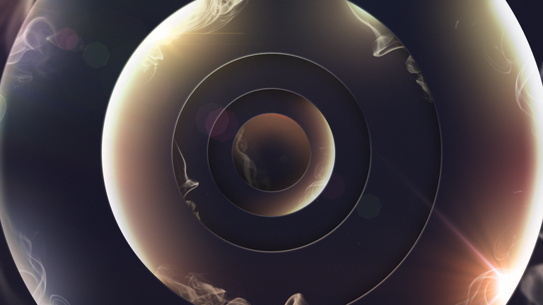
Modern Rings | Texture: Dark Smoke
Avenir Next | Ultra Light & Medium
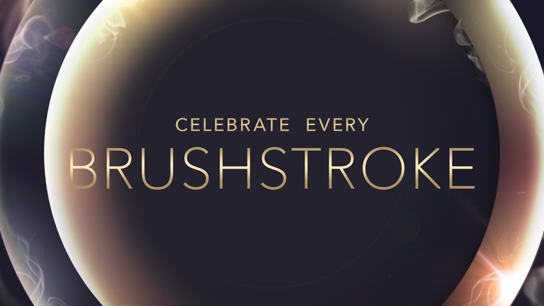
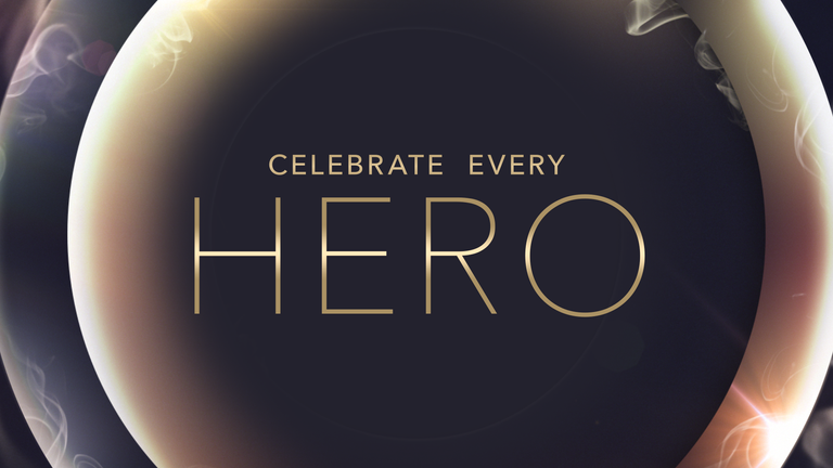
Modern Rings | Animation Direction
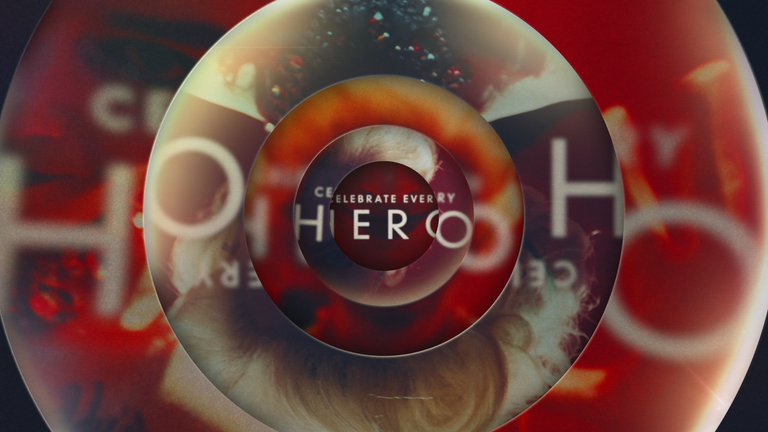
1. The title treatment and footage are distorted and blurred through several layers of rings. Rim lights shine out from under the ring layers, casting illumination and flares into the scene.
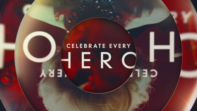
2. The camera pushes into the center of the frame as the rings expand outward, while the rim lights slowly rotate under the rings.
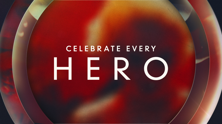
3. The center ring opens up to the edges of the frame to reveal the clean title lockup against obscured footage.
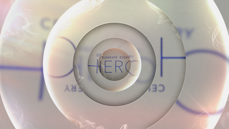
1. The title treatment is seen distorted and blurred through several layers of rings. Rim lights shine out from under the ring layers, casting illumination and flares into the scene. Wispy smoke flows out from under the rings.
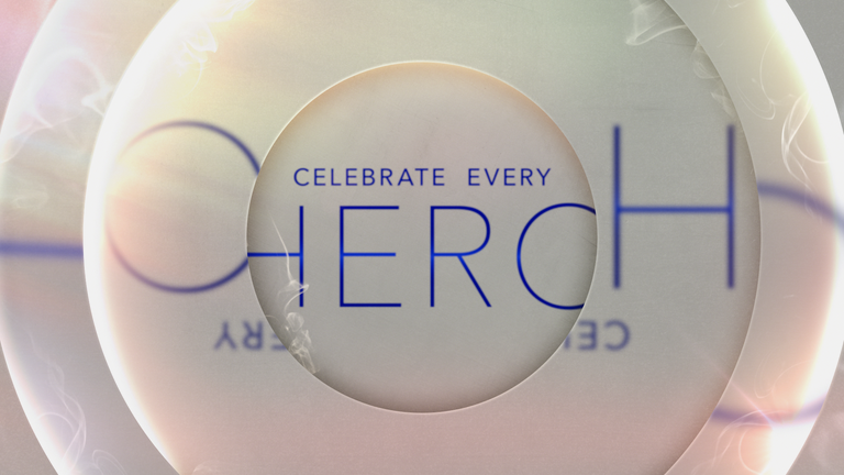
2. The camera pushes into the center of the frame as the rings expand outward, while the rim lights slowly rotate under the rings.
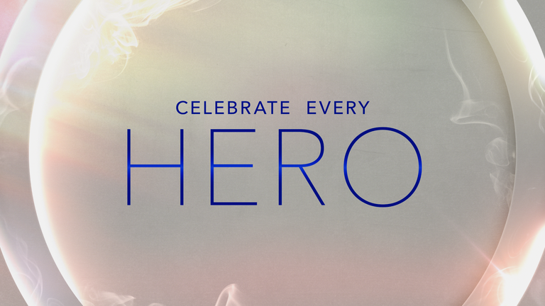
3. The center ring opens up to the edges of the frame to reveal the title lockup against a clean background.
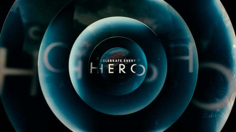
1. The title treatment and footage are cropped and obscured through several layers of rings. Rim lights shine out from under the ring layers, casting illumination and flares into the scene.
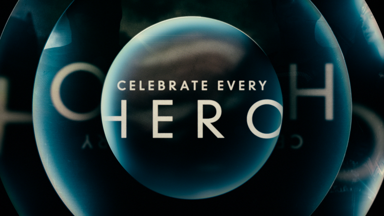
2. The camera pushes into the center of the frame as the rings expand outward, while the rim lights slowly rotate under the rings.
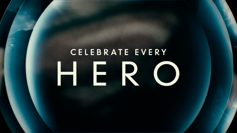
3. The center ring opens up to the edges of the frame to reveal the clean title lockup against obscured footage.
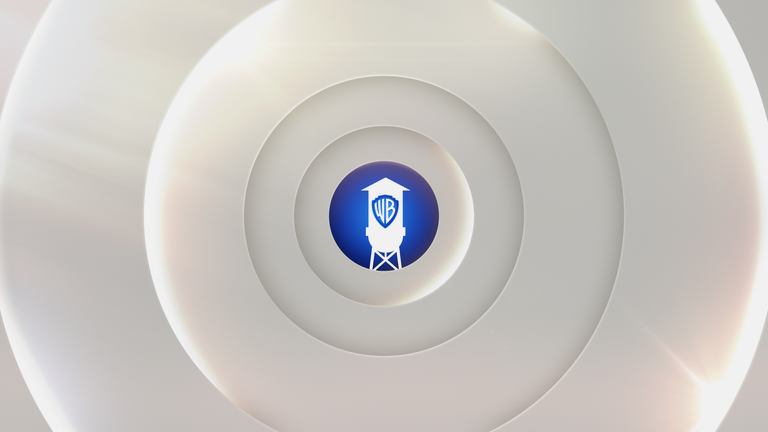
1. A clean WB water tower is seen peeking out behind several layers of bright rings. Rim lights shine out from under the ring layers, casting illumination over the logo and throughout the scene.
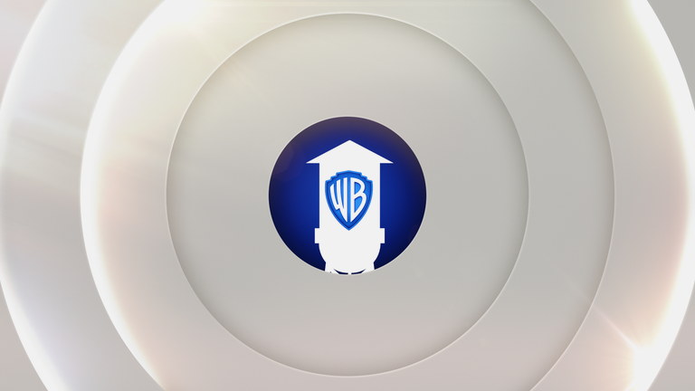
2. The camera pushes into the center of the frame as the rings grow
larger, expanding outward.
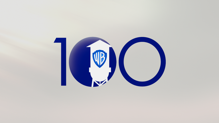
3. The center ring opens past the edges of the frame, leaving the WB water tower against a clean background. The “1” and “0” slide out from behind the water tower to complete the “100” logo lockup.
Modern Rings | Additional Ring Variations

THANK YOU
POINT OF CONTACT
